Decisora.pro — Turning Decision Anxiety Into Guided Clarity
Mapped the decision journey and found where users could feel overwhelmed before signup. Reframed the page around clarity, confidence, and the next best action.
Behavioral Audit

The brief
Decisora is a decision-clarity tool that helps users think through life's big choices using structured frameworks. The product idea is solid. But visitors weren't converting — and the page wasn't giving them a reason to.
I ran a behavioral mini audit to identify the friction points.
What I looked at
I read the landing page through the lens of the Fogg Behavior Model — three levers that determine whether someone takes action: Motivation, Ability, and Prompt. A conversion breaks down when any one of them is missing or mistimed.
What I found
Motivation was low
The headline — "Clarity for the decisions that shape your life" — is abstract. It doesn't show a visitor what life looks like after using the product. There's no before-and-after, no stakes, no concrete outcome. The subtext compounds the problem by defining the product through what it isn't ("No chatbots. No generic advice.") rather than what it delivers. And there's no social proof anywhere on the page — no decision counts, no testimonials, nothing to make a stranger believe this worked for someone like them.
Ability was blocked
Before a visitor has decided they want to engage, the page shows a 6-category domain grid — Career, Business, Money, Relationships, Personal Well-being, Ethics. Then a section with 8 frameworks below that. This is cognitive load arriving before trust has been established. Asking a visitor to categorize their own problem before they've decided they want to is work they shouldn't have to do yet.
The prompt was missing entirely
This was the biggest failure. There's no input box on the page. No moment where the page says "tell me your decision." The only action element above the fold is the domain grid — a filtering UI, not a call to action. The CTA only appears after a category is selected, which means a first-time visitor who doesn't click anything never sees an action to take. The natural interaction for a product like this — a single text field under the headline asking "What decision are you facing?" — was completely absent.
The fix sequence
Lead with a specific outcome headline (show the end-state)
Add one text input box directly below ("What decision are you facing?")
Move social proof above the fold
Push the domain grid to step 2 of the flow
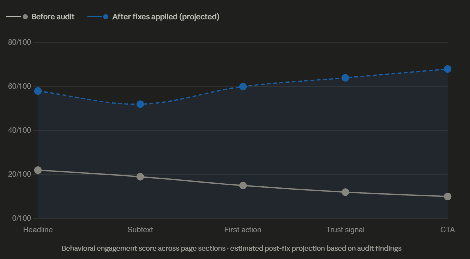
Impact at a glance
What this audit included
Above-the-fold behavioral read (Motivation / Ability / Prompt framework)
Identification of the conversion kill (hidden CTA)
Prioritized fix sequence
Copy direction for headline reframe
Deliverable: Mini Audit
Want this for your product but 10x better?
A full conversion leak audit goes section by section — above the fold, trust signals, CTA architecture, micro-copy, flow friction — and gives you a prioritized fix list you can hand directly to a developer or designer. Turnaround: 72 hours.
Click on it for 72 hrs conversion leak audit