Josie AI — Designing the First “This Was Built for Me” Moment
Turned generic onboarding into a personalized activation path that helps users feel understood, build trust, and continue with more confidence.
SaaS Journey Redesign

Focus Area
Activation, user motivation, onboarding completion, trust-building, and early retention
My Role
Behavioral UX analysis, onboarding strategy, screen redesign, UX copy, journey restructuring, and prototype direction
The Core Problem
Most onboarding flows ask users for information.
But asking questions is not the same as creating momentum.
Josie AI’s onboarding had a strong product idea, but the early experience had an opportunity to feel more guided, more personalized, and more emotionally rewarding before users reached the product.
The main challenge was not just:
“Can users complete the onboarding?”
The better question was:
Can users feel progress, clarity, and confidence before they even reach the product?
That became the focus of the redesign.

What I Noticed
The original onboarding experience had a few friction points that could weaken activation:
The flow felt more like data collection than guided progress
Users were answering questions, but the journey did not always make them feel like something meaningful was being built for them.Loading moments felt generic
Screens like “Loading…” can feel cold and passive. They do not tell the user what is happening or why they should stay engaged.Personalization had more potential
Since Josie AI is built around helping users with their VA journey, the onboarding could do more to reflect the user’s goals, skills, and intentions.The transition from onboarding to learning could feel stronger
The experience needed to create a smoother bridge between setup, plan reveal, lesson content, and the next action.The paywall/value moment could be clearer
Before asking users to commit, the product needed to make the value feel more specific, personal, and justified.
Behavioral Insight
The key insight was simple:
Users do not just continue because the screen is easy.
They continue because the next step feels worth taking.
So the redesign focused on reducing uncertainty and increasing emotional commitment.
Instead of treating onboarding as a form, I treated it as a guided first-value journey.
The goal was to make users feel:
“This product understands me.”
Redesign Strategy
I redesigned the onboarding around five behavioral goals:
1. Replace passive waiting with progress moments
Instead of generic loading, the flow uses more meaningful microcopy such as:
“Analyzing your goals…”
“Matching your strengths…”
“Building your personalized roadmap…”
This turns waiting into anticipation.
The user is not just waiting.
They feel like the product is working for them.
2. Create a stronger emotional hook early
The early screens were redesigned to feel more human, warm, and encouraging.
The goal was to make users feel seen before asking them to continue deeper into the flow.
This matters because early emotional reassurance can reduce hesitation and increase completion.
3. Reorder questions to build momentum
Instead of asking questions only for data collection, the flow was structured to create psychological progress.
Each step should make the user feel closer to a personalized outcome.
The order matters because momentum is not created by screens alone.
It is created by how each decision builds toward the next one.
4. Add skill-based personalization
The redesigned flow uses the user’s goals, skills, and intentions to make the experience feel more personalized.
This helps the product feel less like a generic onboarding and more like a custom plan.
The intended emotional response:
“This was built for me.”
5. Improve the value moment before the paywall
The paywall should not feel like an interruption.
It should feel like the natural next step after the user understands what they are getting.
So the redesign focused on making the plan, lesson direction, and value clearer before asking for payment.
Key Screens Redesigned
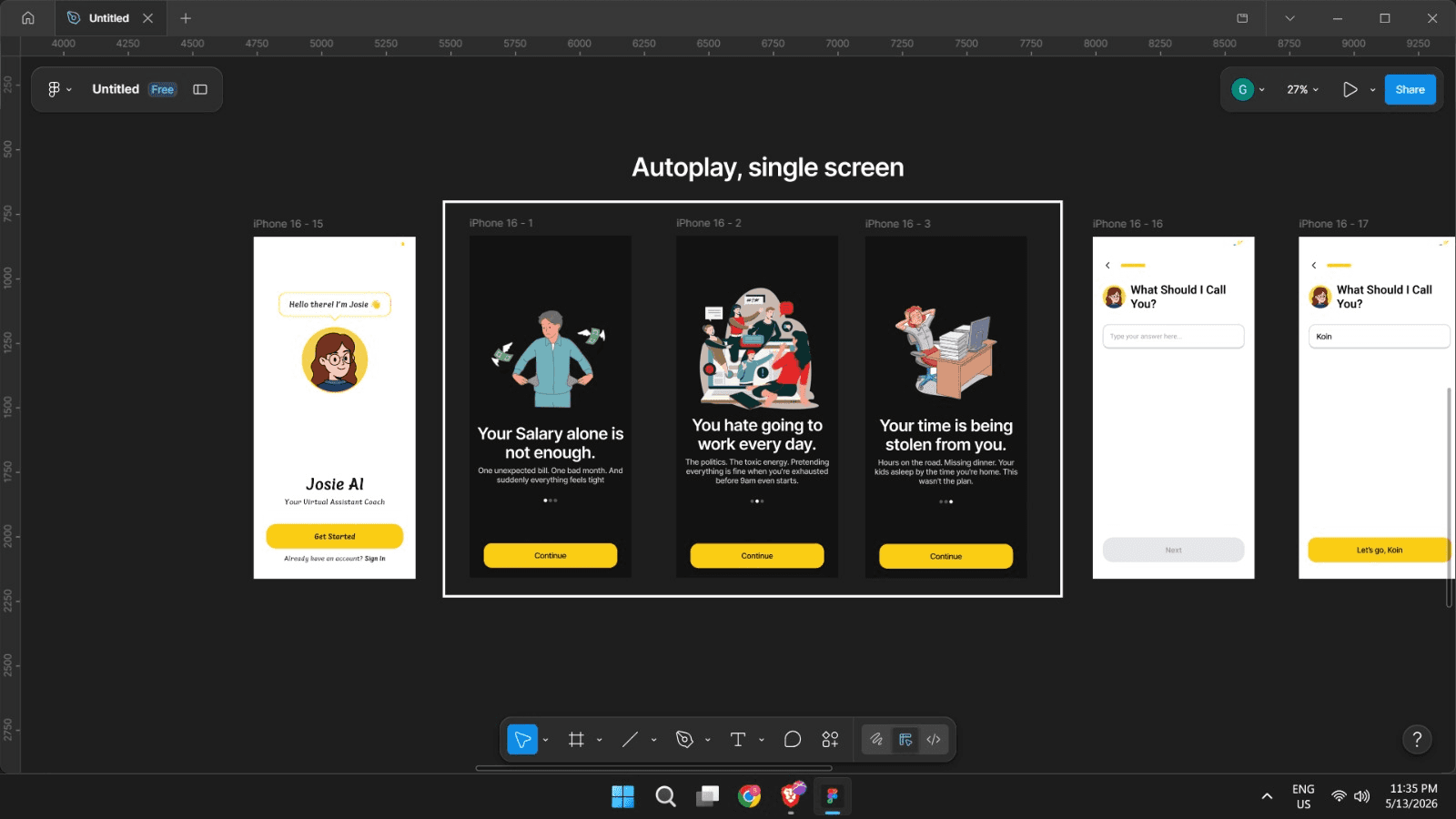
Intro / Hook Screens
The original flow moved users forward quickly, but the redesigned version creates more emotional context before asking for action.
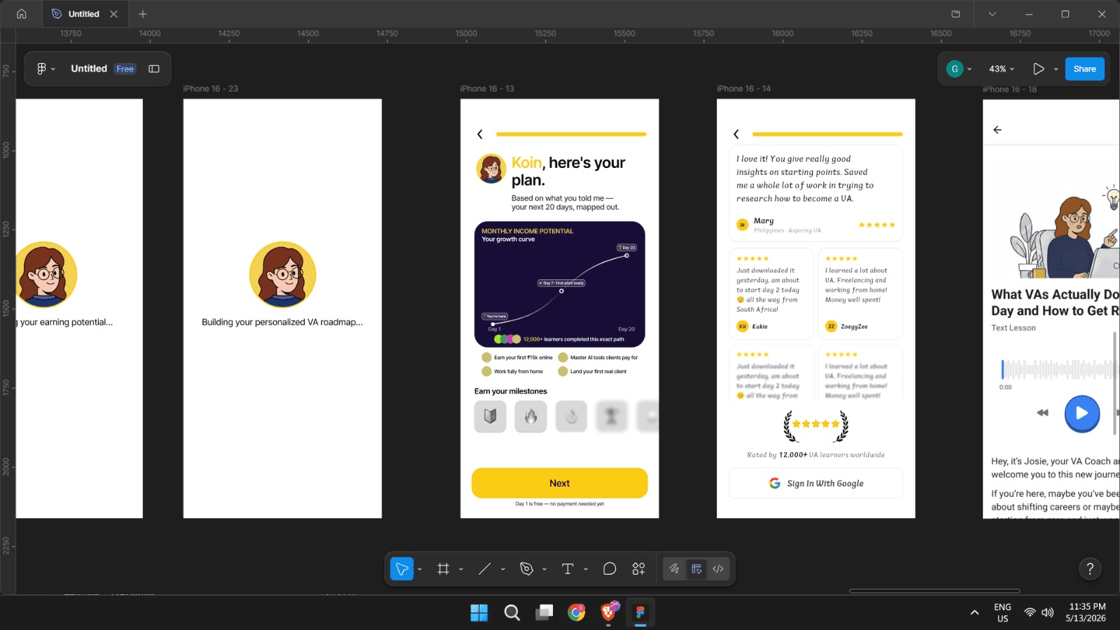
Personalized Loading Screens
Generic waiting moments were replaced with progress-based messages that increase anticipation.
Goal & Skill Selection
Questions were structured to feel like the product is learning about the user, not just collecting inputs.
Personalized Plan Reveal
The plan reveal was designed to feel like a reward moment, not just another screen.
Lesson / Learning Transition
The transition into the learning experience was made more guided and outcome-oriented.

Paywall / Pricing Moment
The pricing screen was reframed so users understand the value before being asked to commit.
Before vs After
Before
The onboarding mainly asked users to move through screens and provide information.
It worked as a process, but it had room to create more motivation, trust, and emotional ownership.
After
The redesigned onboarding guides users through a more personalized journey.
It helps them understand what is happening, why it matters, and what they are moving toward.
Expected Impact

Because this was a prototype redesign and not a live A/B test, the numbers below are shown as projected impact indicators, not production results.
Projected improvements
Higher onboarding completion rate
Lower step-by-step drop-off
Better early trust and motivation
Stronger emotional connection with the product
Faster movement from signup to first value
Clearer justification before the paywall
Improved day-7 retention potential
Lower early churn risk
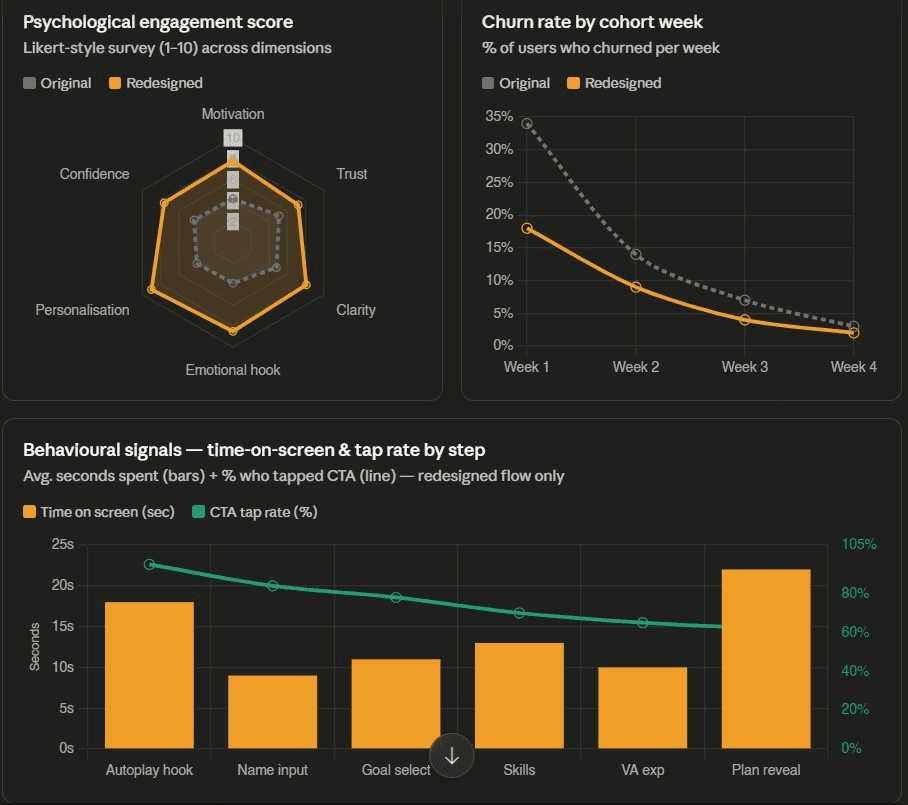
Prototype-Based Impact Model
To communicate the possible business impact clearly, I created a before/after model showing how the redesigned flow could improve activation and retention.
Modeled impact areas
Completion rate
Drop-off rate
Day-7 retention
30-day churn
Psychological engagement
Time on screen
CTA tap behavior
Churn by cohort week
These numbers are not claimed as live product data.
They are used to show the behavioral direction of the redesign and what should be measured if the flow is tested.
Founder Feedback
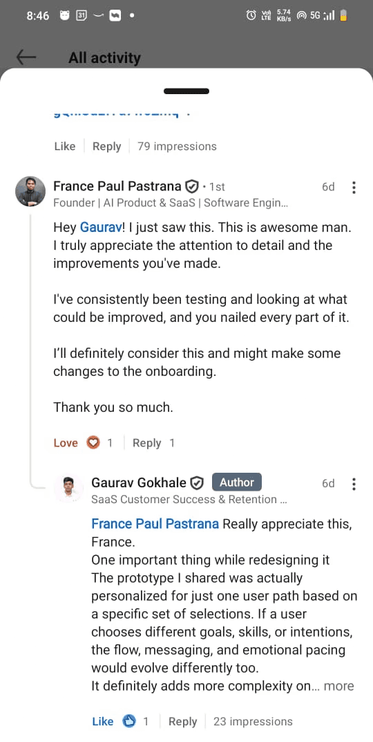
After sharing the redesign publicly, France Paul Pastrana, Founder of Josie AI, responded:
“This is awesome man. I truly appreciate the attention to detail and the improvements you've made. I've consistently been testing and looking at what could be improved, and you nailed every part of it. I’ll definitely consider this and might make some changes to the onboarding.”
This feedback validated that the redesign addressed real areas the founder was already thinking about improving.
What Made This Redesign Different
This was not just a visual redesign.
The work focused on the decisions behind the screens:
What does the user need to feel before continuing?
Where does uncertainty appear?
Where does motivation drop?
Where should the product create trust?
When should the user see value?
How can the next step feel obvious instead of forced?
That is the difference between redesigning screens and redesigning behavior.
Final Outcome
The redesigned onboarding turns Josie AI’s setup flow into a more guided, personalized, and emotionally engaging journey.
Instead of making users feel like they are filling forms, the flow makes them feel like the product is building something for them.
The main shift:
From onboarding as data collection
to onboarding as guided activation.
What I Would Test Next
If this redesign went live, I would measure:
Onboarding completion rate
Drop-off by step
CTA click-through rate
Paywall conversion
Time to first lesson started
Day-1 and day-7 retention
Trial-to-paid conversion
Early churn rate
The goal would be to prove whether the new emotional pacing and personalized journey increase activation and retention.
Summary
Josie AI already had a strong product direction.
My redesign focused on making the first experience feel clearer, warmer, and more personalized so users are more likely to continue.
The biggest improvement was not just in how the screens looked.
It was in how the journey made users feel:
understood, guided, and ready to continue.