Webframetech — When the CTA Wasn’t the Problem, Trust Was
Mapped where hesitation formed before the CTA and redesigned the page flow to build trust earlier, reduce doubt, and make the next action feel safer.
Friction Breakdown

View Prototype
Context
Webframetech is a technically strong development agency specializing in JAMstack architecture and composable commerce. Their work is credible. Their website wasn't communicating that credibility — at least not fast enough to matter.
They came to me not for a visual refresh, but because potential clients were landing on the site and leaving without making contact. The product was solid. The decision environment wasn't.
What was actually broken
Before touching any design, I ran a behavioral audit of the existing site. The core problem wasn't aesthetic. It was structural. The site was treating visitors like readers when they were actually making a decision.
Visitors arriving at an agency website typically have one primary goal: quickly determine whether this company can solve their problem and whether they can trust them enough to have a conversation.
The original structure had four compounding friction points:
01 No clear decision path- Multiple sections without a narrative arc guiding the user toward action.
02 High cognitive load- Dense information blocks requiring active interpretation, not passive scanning.
03 Delayed trust signals- Social proof appeared too late in the page — after skepticism had already formed.
04 Weak conversion momentum- CTAs existed but appeared before sufficient trust had been established.
The framing that drove all decisions
I don't start with wireframes. I start with a hypothesis about human behavior that the design should test.
If the page structure prioritizes clarity, proof, and progressive trust-building — in that order — visitors will be more likely to feel confident enough to initiate a conversation.
This hypothesis shaped every design decision that followed. It also gave me a clear way to evaluate the redesign with users — not "does this look better?" but "do you feel more confident about this company after viewing this page?"
Behavioral framework
Six principles informed the structural redesign — each chosen because it addressed a specific observed friction point, not because it was fashionable.
Hick's law- Fewer choices presented at once — the hero CTA structure was simplified to two clear paths, not five.
Cognitive load- Service descriptions were compressed to 1–2 lines. Information was chunked for scanning, not reading.
Social proof- Client logos moved above the fold — right after the hero — to front-load legitimacy before curiosity could become skepticism.
Visual hierarchy- Value propositions and CTAs were made visually dominant. Supporting detail was subordinated, not removed.
Progressive disclosure- FAQ section used accordion pattern — users self-select the concerns that matter to them instead of processing all objections at once.
Gestalt- Case study and service cards were normalized into consistent grid layouts — reducing the visual effort of comparing and scanning.
Design Decisions
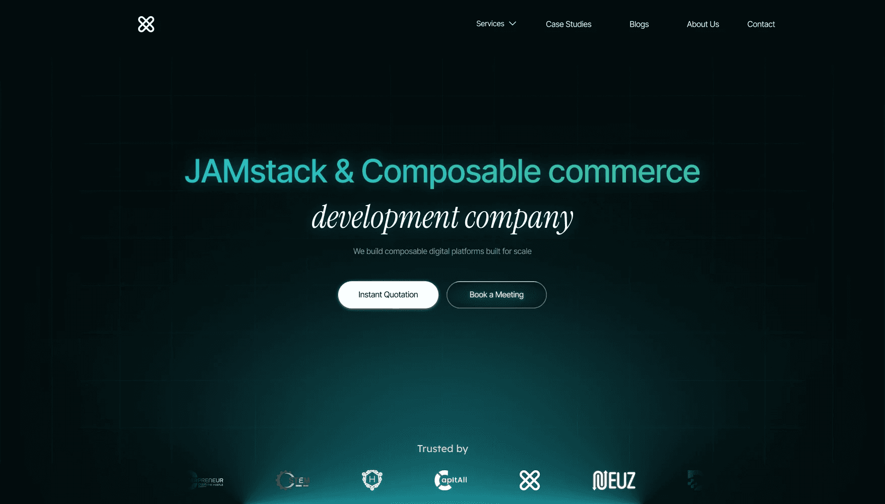
1. Clear Value Proposition in the Hero
The hero section was redesigned to immediately communicate:
what the company does
who it helps
why it matters
Two CTAs were introduced:
Book a Discovery Call
View Case Studies
This supports two behavioral paths:
high-intent users take action
exploratory users review proof first
2. Early Credibility Signals
Client logos were positioned below the hero.
This introduces social proof early, reducing skepticism and reinforcing legitimacy before users explore deeper.
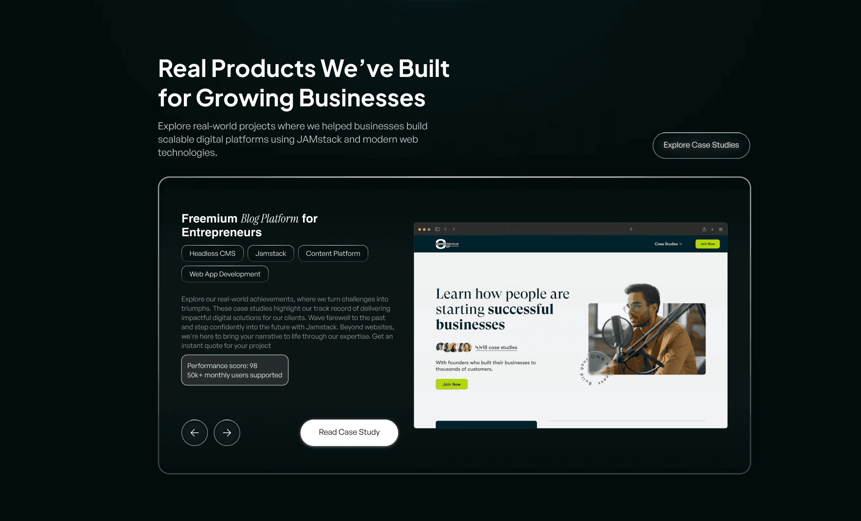
3. Proof Before Promotion
Instead of immediately presenting services, the redesign highlights real work first.
Case studies demonstrate:
real projects
outcomes
capabilities
This follows a common decision pattern:
Users trust evidence more than claims.
4. Simplified Case Study Layout
The case study section was redesigned to make information easier to scan.
Key elements highlighted:
project category
platform
result indicators
visual preview
This reduces cognitive effort when evaluating credibility.

5. Process Transparency
A structured 3-step workflow was introduced:
Discovery
Architecture & Design
Development & Launch
This reduces uncertainty about how collaboration works and increases perceived professionalism.
6. Service Grid for Quick Scanning
Services were organized into a 3 × 2 card layout.
Short descriptions ensure users can quickly understand:
what services exist
where their needs might fit
This follows F-pattern scanning behavior, where users skim before committing attention.
7. Reduced Content Density
Service descriptions were shortened to 1–2 concise lines.
The goal was to:
reduce reading friction
maintain visual rhythm
support fast scanning
8. Focused Testimonial Section
Rather than presenting multiple testimonials at once, the design emphasizes a single clear endorsement supported by platform verification.
This approach avoids overwhelming users while still providing strong validation.
9. FAQ for Decision Friction
An FAQ section addresses common concerns such as:
technology stack
migration possibilities
integrations
performance
Using an accordion pattern enables progressive disclosure, allowing users to explore only what matters to them.
10. Strong Final Conversion Moment
The page concludes with a clear conversion section encouraging users to:
Book a Discovery Call
By this point in the journey, the user has already encountered:
credibility signals
real work
service clarity
testimonials
answered concerns
The CTA appears after sufficient trust has been established.
Final User Journey
The redesigned structure creates a clearer narrative:
Value proposition
Credibility signals
Proof of work
Process transparency
Service offerings
Client validation
Objection handling (FAQ)
Final conversion
This sequence aligns with how users typically evaluate service providers.
What users said
User testing focused on a single question: did the redesigned site make you feel more confident about working with this agency?
Users consistently described the redesigned experience as feeling more trustworthy and easier to understand — without being able to pinpoint exactly why. That's the goal. Behavioral design should feel inevitable, not visible.
From user testing observations, Webframetech redesign
The key shift: users stopped asking "what do they do?" and started asking "how do I get in touch?" — which is exactly the behavioral transition the redesign was built to create.
What this project reinforced
Agency websites are not portfolios. They are decision environments. And decision environments should be designed around how people actually make decisions — not around what companies want to say about themselves.
The most important insight from this project: trust is not built by adding more proof. It's built by sequencing proof at the exact moment skepticism would otherwise form.
Behavioral UX isn't a layer you add to good design. It's the foundation you build the structure on.