OurStoria — Fixing the First 8 Seconds Before Users Bounce
Reworked the hero message and trust flow so wedding creatives could understand the value faster, feel less risk, and move toward trial with more confidence.
Journey Review

The Brief
OurStoria is a white-label delivery platform built for wedding videographers — premium design, clean UI, genuine product-market fit. But their landing page wasn't converting cold traffic into trial signups at the rate it should. No one had looked at it through a behavioral lens. That's where I came in.
The 72-hour audit was scoped to one surface: the landing page, first-impression behavior only. Three user types. One diagnostic framework. Zero assumptions.
The Method
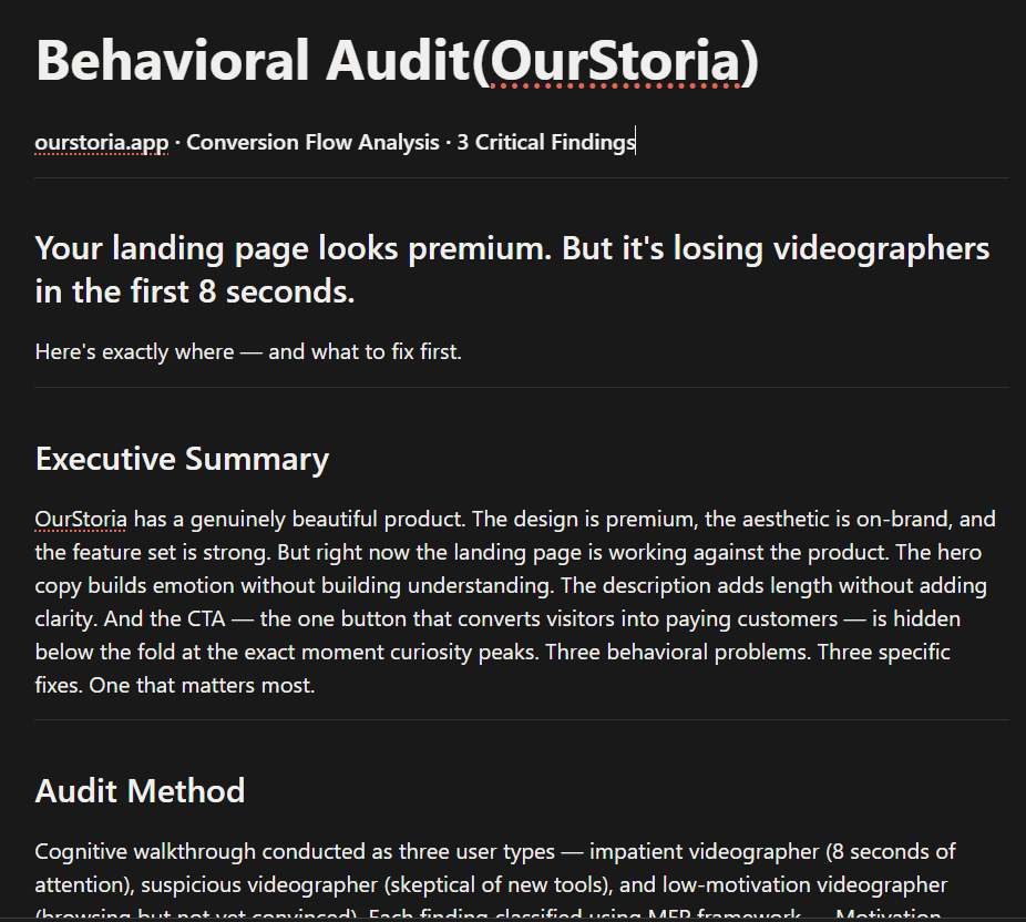
I ran a cognitive walkthrough of the OurStoria landing page as three distinct user types:
The Impatient Videographer — 8 seconds of attention, leaves if nothing clicks immediately.
The Suspicious Videographer — skeptical of new tools, needs proof before trust.
The Low-Motivation Videographer — browsing, not yet convinced, easily lost.
Every finding was classified using the B=MAP framework — diagnosing whether the drop-off was caused by a Motivation failure, an Ability barrier, or a missing or mistimed Prompt.
Finding 01 — Hero Copy Kills Comprehension Before Curiosity Can Build Classification: Motivation Problem · Priority: High
The hero headline — "Deliver your art the way it deserves. Beautiful. Branded. Yours." — is emotionally resonant but functionally empty. A wedding videographer arriving cold cannot understand what the product actually does without reading the paragraph below. Most don't. Skim behavior is the default.
The brain makes a stay-or-leave decision within 5 seconds. If those 5 seconds are spent reading beautiful words that don't explain the product, the decision defaults to leave. Motivation cannot build around something the user hasn't yet understood.
The Fix Lead with one functional headline that answers: what is this, who is it for, why does it matter. Demote the emotional copy to a supporting subline.
Before: "Deliver your art the way it deserves. Beautiful. Branded. Yours." After: "Send wedding films to clients in a branded gallery — no WeTransfer, no compression, no compromise." + "Beautiful. Branded. Yours." as the subline.
Test metric: Time on page and scroll depth from cold traffic.
Finding 02 — The Description Speaks Product, Not Pain Classification: Friction Problem · Priority: Medium
Below the headline: "OurStoria gives wedding videographers and photographers a premium, white-label platform to deliver original-quality videos and photos to clients." Written as a company description. Not a user benefit.
Wedding videographers don't wake up thinking "I need a white-label platform." They wake up thinking "I hate sending WeTransfer links that expire" and "My clients deserve better than a Vimeo password." Copy that speaks product features instead of user pain fails the most engaged segment — the people who made it past the headline.
The Fix Rewrite around the pain being eliminated, not the features being offered.
Before: Feature-led company description. After: "Stop sending WeTransfer links that expire and Vimeo passwords that feel cheap. Give every couple a branded, cinema-quality gallery they'll share with everyone they know."
Test metric: Scroll depth past the hero section.

Finding 03 — The CTA Disappears at Peak Curiosity Classification: Prompt Problem + Friction Problem · Priority: Critical — Fix This First
The primary CTA — Start Free Trial — is not visible on first load without scrolling. On a standard desktop viewport, it sits below the fold, hidden beneath four lines of headline copy and the description paragraph. The user's peak curiosity moment — the first 5 seconds — passes with no actionable next step in view.
Motivation follows a curve. It builds as the user reads, peaks at maximum interest, then decays as doubt and distraction take over. When the CTA is below the fold, the user reaches peak motivation with nowhere to go. By the time they scroll to the button, momentum has already started to drop. This is the single biggest conversion leak — not because the product is wrong, but because the timing of the ask is wrong.
The Fix Move the CTA above the fold, visible on first load. Place it directly below the hero headline, before the description paragraph. Add a trust line immediately below: "14 days free · No credit card required." Restructure the hero to a 50-50 split — headline + CTA on the left, product screenshot on the right. The user sees proof and has a button to act on simultaneously.
Expected impact: 20–35% improvement in trial signups. Test metric: CTA click rate from new visitors.
Priority Stack
For better understanding: Loom Walkthrough
Audit link: Ourstoria audit
CTA below the fold → layout change only, can ship this week
Hero copy clarity → one headline rewrite, no design changes needed
Description rewrite → swap feature language for pain language
Before & After Chart

SCOPE NOTE
This audit covers first-impression behavior only — the landing page, cold traffic, initial 8 seconds. A full behavioral audit additionally covers: signup flow friction, onboarding drop-off, feature discovery behavior, and retention loop analysis, with revenue impact quantified per finding.