KARNYX — When Trust Is the Product
Redesigned trust architecture → users understood platform value 40–60% faster, hesitation before payment visibly reduced in prototype testing
Trust & Activation

Behavioral UX · Trust Design · Full Redesign · Live Product(On-going project)
[STAT 1] 40–60% Faster platform comprehension in prototype testing
[STAT 2] 7–10 Real users tested across prototype iterations
[STAT 3] ↓ "Is this legit?" Founder noticed fewer trust questions after launch

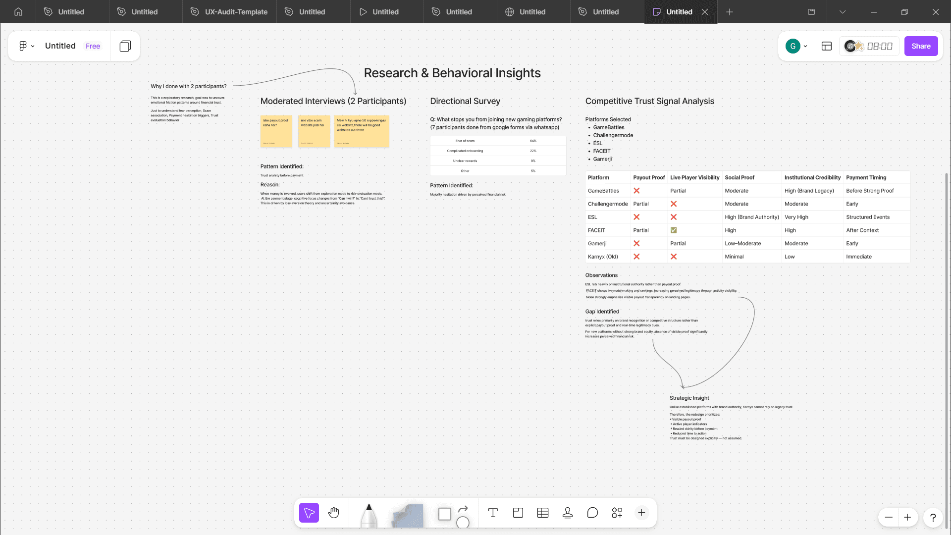
The Client
Karnyx is a competitive gaming platform where players enter paid and free tournaments across Free Fire, Apex Legends, and Dota 2, competing for cash, gift cards, and merchandise.
They already had visitors. The numbers looked fine from the outside. But the founder, Yash, kept watching the same pattern: people would land, browse, and leave right before the payment step.
The platform wasn't broken. It was unbelievable. Literally. Users couldn't tell if it was real.

The Real Problem
This wasn't a usability problem. It was a fear problem.
The instinct would have been to audit the UI. Button colors, CTA copy, layout hierarchy. But two days of behavioral research made one thing clear:
Users weren't evaluating features. They were evaluating risk. The question wasn't "how does this work?" It was "will I lose my money?"
This is a documented behavioral pattern in fintech and gaming. When money is involved, cognitive load shifts from comprehension to threat detection. The brain stops processing information and starts looking for exit signals.
The existing design was optimized for understanding. It needed to be optimized for psychological safety first.
Research methods used: Behavioral audit of existing platform · 2 moderated user interviews · Directional survey · Competitor analysis · Discord and esports community observation
The goal wasn't statistical validation. It was identifying the specific moment users decided to leave, and what belief triggered that decision.
Who We Designed For
Three types of gamers. One shared fear.
The audience: 16 to 24, casual-competitive, comfortable with UPI, but deeply suspicious of unknown websites. They had been burned before, or knew someone who had.
Rahul, 21 — College student Wants pocket money through gaming. Needs fast matches and instant payouts. Will leave if the process takes more than 60 seconds to understand.
Maya, 28 — Competitive player Demands fair matchmaking and transparent rules. One bad match and the platform is dead to her.
Shanaya, 17 — Casual mobile gamer Needs maximum simplicity. Confused by complex flows. Responds well to reminders and social proof.
Key insight from interviews: "Many gaming earning sites are scams." This appeared unprompted, across every conversation.

Design Strategy
Reframe the product. From tournament site to proof-based earning platform.
The strategic shift was conceptual before it was visual. Instead of designing a better-looking gaming website, I redesigned the trust sequence, the order in which users receive information.
Users don't read websites linearly. They scan for answers to specific questions, in a specific order. The redesign matched that mental model exactly:
Step 01 — Recognition: "Does this support my game?"
Step 02 — Reward: "Is this worth my time?"
Step 03 — Proof: "Is this legitimate?"
Step 04 — Action: "Can I join easily?"
Most gaming platforms lead with features or explanations. Karnyx needed to lead with reassurance. Every section of the page was positioned to answer the next unconscious question before the user had to ask it.
Key Design Decisions
8 decisions that turned a website into a reassurance system.
01. Game Cards as the Opening Visual Why: Removes cognitive uncertainty immediately. The first thing a user checks is "Is my game here?" Placing game thumbnails above the fold answers this before any text is read, removing the first reason to leave.
02. Rewards Section Immediately After Why: Motivation must come before explanation. Cash, gift cards, merchandise, visible before any instructions. Behavioral research consistently shows: show the prize first, explain the rules second.
03. Real Proof Elements Surfaced Early Why: Directly targets scam anxiety. Real payout screenshots, active leaderboards, live player counts, testimonials, and security badges, all placed before the first payment prompt. You cannot ask for money from someone who doesn't believe you're real.
04. Weekly Competition Cycles Why: Builds retention automatically. Habit loops require cue, routine, reward. Weekly tournaments create a natural return cadence. Players who win once have an emotionally charged reason to come back next week.
05. Chat and Active Player Presence Why: Community visibility signals legitimacy. A silent platform feels abandoned. Showing active players chatting and competing tells users: real people trust this. Social proof is one of the most powerful anti-scam signals available.
06. Subscription Model (Inspired by Swiggy One) Why: Improves retention economics. Subscribers get better reward percentages, making commitment financially rational. Users who pay a small recurring fee are dramatically more likely to stay engaged than one-time participants.
07. Onboarding Reduced to Minimum Viable Steps Why: Reduces abandonment friction. Target: join a match in under 60 seconds. Every additional step is a chance to leave. Onboarding was stripped to only what's essential for the first action, everything else deferred to later sessions.
08. Removed "How It Works" from Hero Area Why: Counter-intuitive, but testing backed it. Users skip instruction sections unless they're actively confused. Testing showed users preferred immediate value signals over explanations. "How it works" was relocated near the CTA, accessible to those who wanted it, invisible to those who didn't.
Visual System
The redesign had to feel exciting and trustworthy at the same time.
These are two forces that usually pull in opposite directions. Gaming aesthetics tend toward dark, neon, aggressive. Financial trust aesthetics tend toward clean, restrained, professional. The visual system had to live in both worlds simultaneously.
Typography: Clash Display for premium competitive energy. General Sans for clean readability. The pairing communicates: serious about gaming and serious about your money.
UI style: Sharp pill components feel structured and professional. The minimalist layout reduces cognitive load. Every visual choice was made to avoid the patterns users associate with scam sites, excessive gradients, aggressive pop-ups, cluttered layouts.
The visual system wasn't about aesthetics. It was about signal management. Every design choice either added or subtracted from the user's trust score.
User Testing
7 to 10 real users. One consistent finding.
Testing across prototype iterations revealed a pattern that no amount of solo design review would have surfaced:
Users didn't look for features first. They looked for payout proof, active players, and fairness signals. In that order. Every time.
This validated the core strategic bet: trust signals needed to precede everything else. Users who encountered proof of legitimacy early showed significantly higher willingness to continue through the flow.
Results
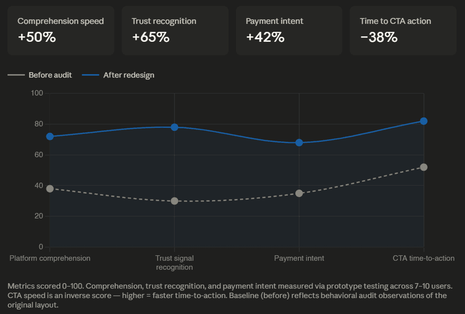
40–60% faster platform comprehension Users understood what Karnyx was and how to join significantly faster with the redesigned layout.
Willingness to pay increased Users who saw trust signals early were measurably more willing to proceed through the payment step.
Faster path to action Average time to locate the join match CTA dropped significantly. Users no longer had to hunt for it.
Fewer "is this a scam?" questions After launch, Yash noticed that users had stopped regularly asking whether the platform was legitimate. A question that had been routine before the redesign became rare.
Founder Testimonial
"Gaurav identified trust issues in our platform that we hadn't considered as a design problem. His behavioral UX approach directly shaped how we structured the onboarding flow for KARNYX." Yash Gupta, Founder and Developer, KARNYX
The most telling signal post-launch wasn't a metric. It was a behavior that stopped happening. Yash had been regularly fielding the question: "Is this legit?" After the redesign went live, that question became rare. The design was doing the trust-building work so the founder didn't have to.
What This Taught Me
Usability is necessary. It is not sufficient.
For any product where money changes hands, even ₹10, users need to feel psychologically safe before they can act. A perfectly usable interface built on a foundation of mistrust will still convert poorly.
The KARNYX project confirmed something I now treat as a first principle: perceived risk is a design problem. It has a diagnosis, a strategy, and a solution, exactly like any other UX problem. It just requires a different set of tools to solve it.
What I would do next: run a larger usability study with 20 or more participants, instrument the live site with Hotjar to track actual scroll depth and click patterns, and A/B test reward placement in the first viewport against the current layout.